Make the healthy choice with our fries.
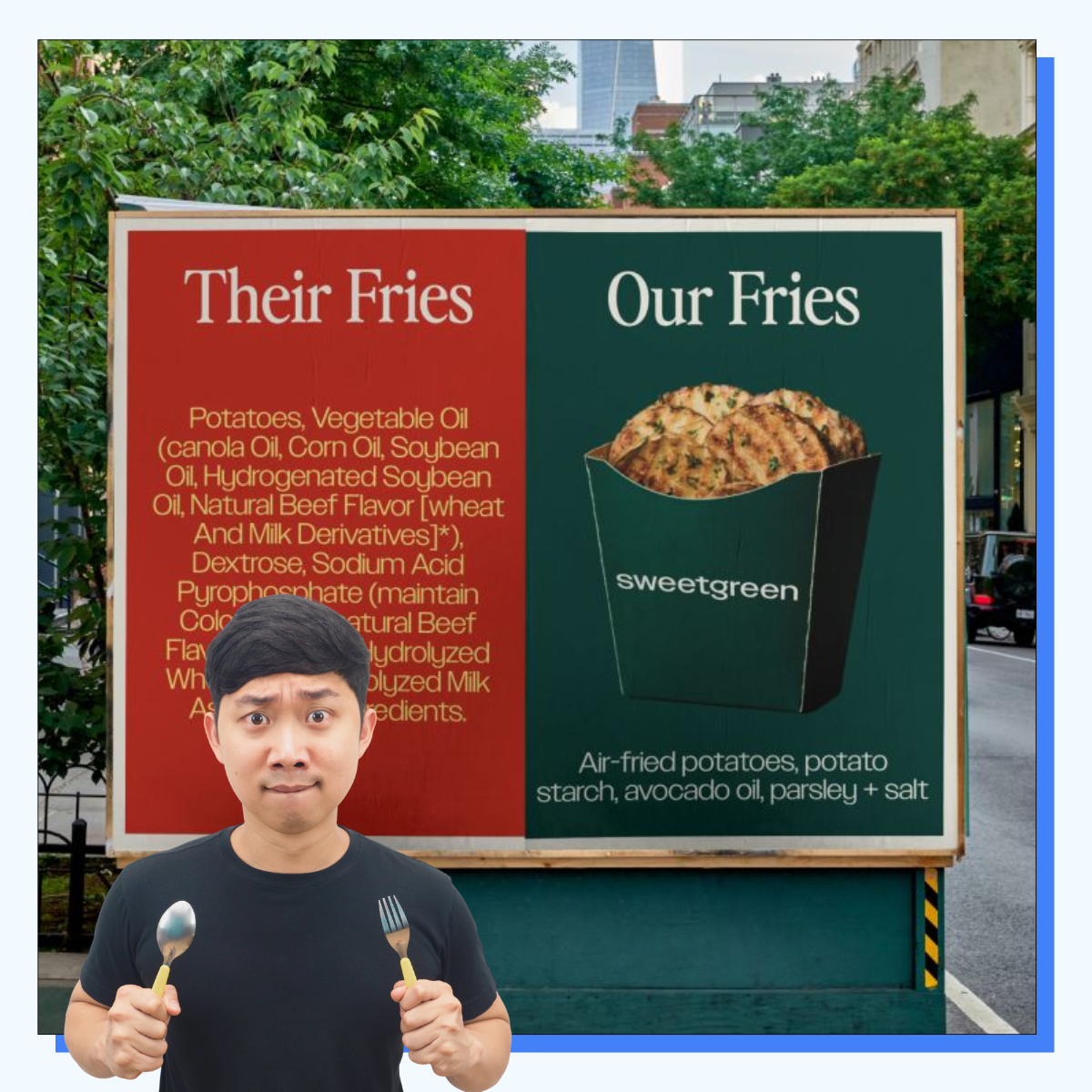
This is a textbook example of using contrast to make your product look irresistible. Sweetgreen throws down a visual gauntlet: side-by-side, theirs is an image of golden, clean fries with nothing weird in the ingredients, while the "other" side just lists a bunch of junk. No need to read fine print or squint at copy. You instantly get the healthy vs not message. Lesson: If you can show why you're different in one glance, do it. Don't be afraid of going visual and putting your competition on the same slide.