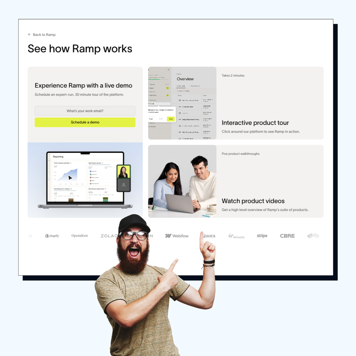
Nail your color system and modals, your demo signals instant competence and quality.
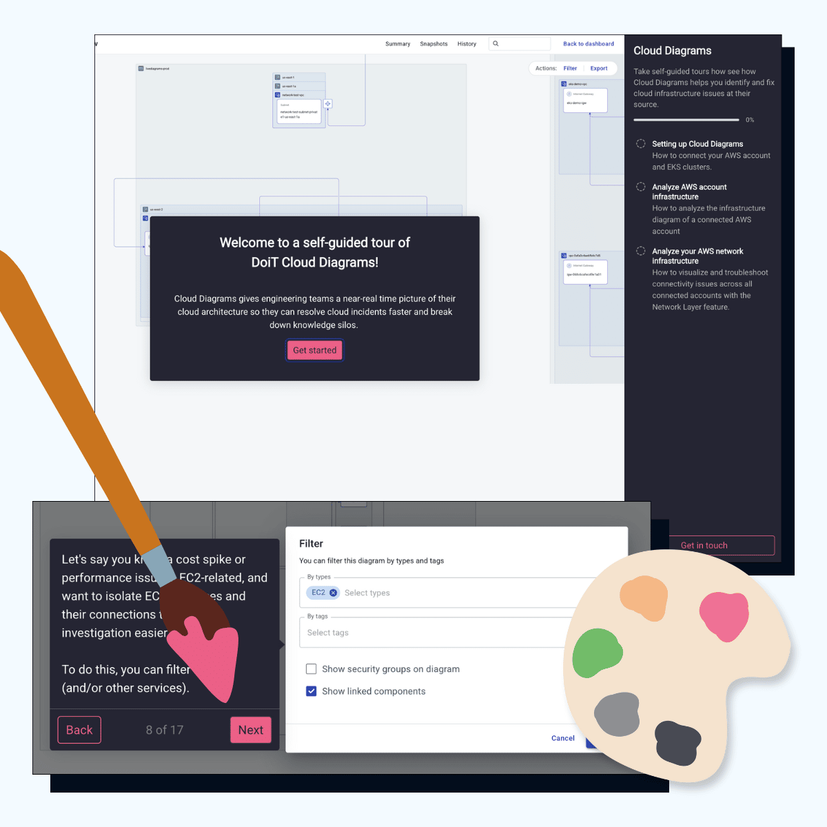
Doit's demo caught our eye before we even started clicking around. Their model theme is so clean, I want a pair of Jordan's just like it. It's one of those demos where you immediately think "damn, these people have their act together." The colors pop without being obnoxious and everything flows perfectly. Caring about colors isn't shallow because: People judge your entire brand in like 0.3 seconds Good design makes people assume your software doesn't suck It shows you sweat the details while others are using stock themes This is something Jason and I nerd out about with every client. We build themes and modal styles that don't look like someone just hit "default” and called it a day. Your demo's visual game is basically your dating profile photo. You could be the funniest person alive, but if your holding a fish in your profile picture, nobody's swiping right.